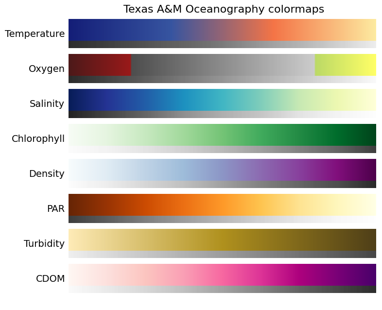
Colormaps for plotting oceanographic fields in intuitive and clear plots that are nice to look at were previously proposed, and have now been updated. Updates include:
- Less kinked lightness profile for the temperature colormap
- Stronger saturation gradient for hypoxic levels of oxygen and no lightness kink for supersaturated oxygen levels
- Added a colormap for density
- Using the previous turbidity colormap now for PAR
- New colormap for turbidity
The colormaps are available in an easy-to-use Python package. Also shown with each colormap is a grayscale version of the colormap, to demonstrate that the colormaps would be reasonably-well printed in black and white. Here are the colormaps in a matplotlib-style gallery:
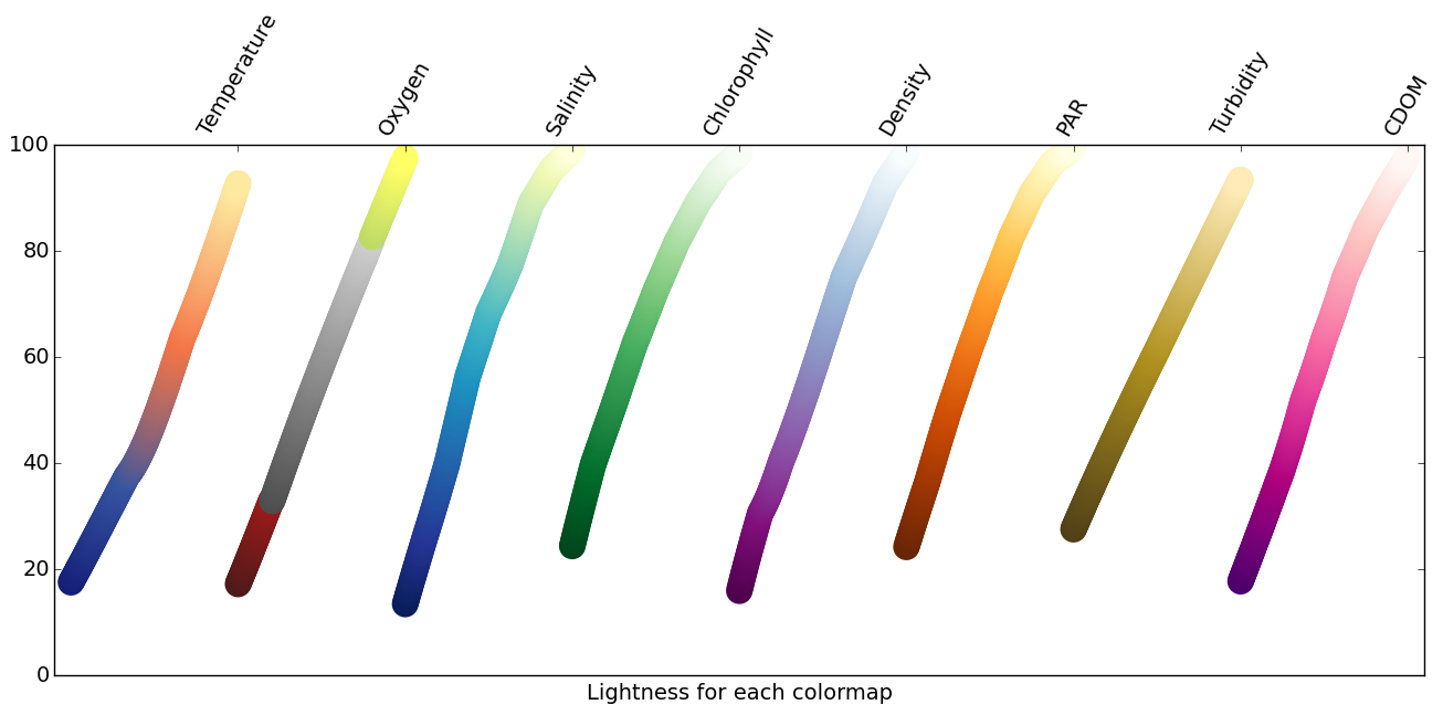
Lightness profiles of the colormaps are helpful to check out for these sequential colormaps.
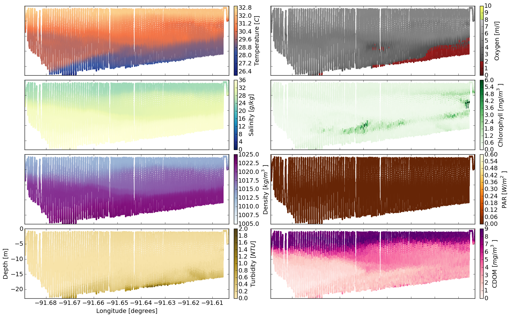
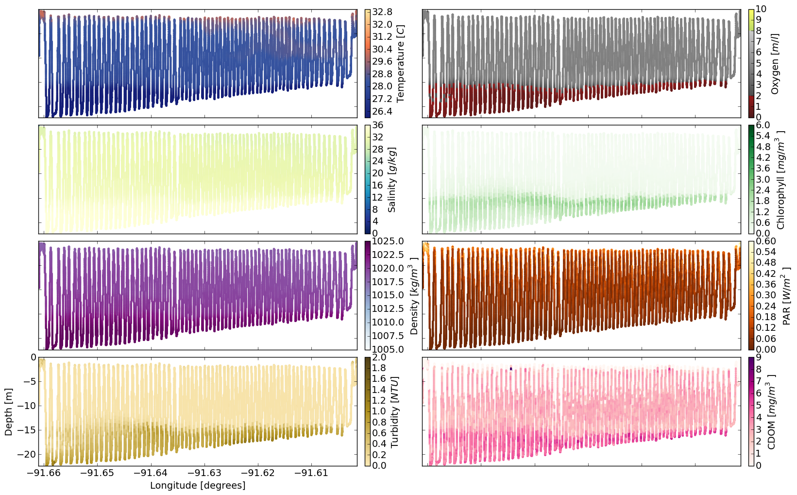
Using sample data from a hypoxia cruise, I plotted up the colormaps with actual data to show how they would look. The colorbars are meant to be intuitive as much as possible to the field being plotted. So, for example, the temperature colormap goes from blue-ish (cold) to red/yellow-ish (warm), but is still a sequential colormap. Or, more chlorophyll is represented by more green. The grayscale profile of oxygen is consistent, from dark to light, but has two regions of altered hue to highlight very low oxygen levels (hypoxic conditions) and super-saturated conditions (green-yellow).